From Complaint to Cross-Functional Clarity
Overview
Data Lake was an emerging enterprise data platform intended to support analytical and modeling work across the organization. Despite its strategic importance, the only way to discover or request available datasets was through a home-grown, lengthy, administrator‑centric SharePoint form. The process was difficult to navigate, created uncertainty for users, and slowed down access to the data needed for analytical work.
I was brought in as one of two UX designers on a one‑month task force convened by senior leadership. My role was to understand the user experience accessing Data Lake, map the workflow, identify friction points, and create a clear communication artifact that aligned engineering, data science, and leadership around opportunities for improvement.
Context & Problem Space
At the time, the Data Lake was still in its early stages. The platform itself was technically robust, but the surrounding workflows, governance structures, and access mechanisms had not yet matured. Because this work took place within a large, security‑sensitive healthcare organization, cloud adoption was intentionally conservative. Many modern data‑access patterns—such as self‑service catalogs, automated approvals, or cloud‑native discovery tools—were not yet available.
As a result, the SharePoint‑based Data Usage Request (DUR) form had become the single, manual gateway to the Data Lake.
A single user’s feedback reached senior leadership, prompting the formation of a task force and bringing UX into the process for the first time.
The DUR form was responsible for:
- Discovering what datasets existed
- Requesting access
- Documenting intended use
- Initiating risk and governance reviews
- Triggering ingestion or consumption workflows
The form had grown organically over time and presented several usability challenges:
- It was long and difficult to navigate.
- Required fields were not always clearly indicated.
- Terminology reflected administrative or engineering language rather than user language.
- Instructions were limited or absent.
- The workflow was not documented elsewhere.
- The form relied on a generic SharePoint “Save” button rather than a clear submission mechanism.
During my user conversation, I also learned that once a request was approved, there was no visibility into prior submissions. This meant users could not reference previously approved requests that might have aligned with their needs, which could have streamlined approvals and reduced duplication. The lack of visibility unintentionally limited discoverability and slowed down the overall workflow.
My Role
I served as the primary UX contributor during the task force, responsible for:
- Learning the data science domain quickly
- Conducting a user conversation with the data scientist who raised the initial concern
- Mapping the end‑to‑end workflow for requesting and accessing data
- Identifying usability and clarity issues within the DUR form
- Analyzing terminology, field groupings, and required information
- Creating a clear, branded PowerPoint presentation that explained the workflow, highlighted friction points, and proposed improvements
- Validating the messaging and recommendations with the data scientist
- Delivering the refined artifact to my UX supervisor for presentation to the task force
Although another UX designer was assigned, I carried the majority of the work due to scheduling constraints.
Challenges
The project was shaped by several constraints common in regulated enterprise environments:
- UX was brought in late, with no predefined expectations.
- The workflow was undocumented and relied on institutional knowledge.
- The form was built in SharePoint, limiting design flexibility.
- The timeline was compressed due to executive attention.
- The domain was unfamiliar, requiring rapid learning.
- The form served both users and administrators, creating competing needs.
- Cloud‑native data‑access tools were not yet available due to security and compliance requirements.
These constraints required a systems‑thinking approach grounded in clarity, governance awareness, and user empathy.
Approach
1. Rapid Domain Learning
I began by meeting with the data scientist who raised the initial concern. She explained her role, how she and her colleagues used Data Lake, and where the access workflow created uncertainty or delays. This conversation helped me understand the broader context: the workflow was not intentionally difficult, but it had evolved without a user‑centered structure, making it challenging to complete confidently.
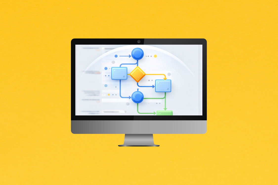
2. Workflow Mapping
Using insights from the conversation and the structure of the form itself, I mapped the end‑to‑end workflow, including:
- How users discovered available datasets
- How they initiated requests
- How administrative and risk reviews were triggered
- How approvals were communicated
- How data was ultimately accessed
This mapping revealed several points where clarity, guidance, or visibility could improve the experience.
3. Form Analysis
I analyzed the DUR form field by field, identifying:
- Terminology that could be clarified
- Fields that would benefit from grouping or sequencing
- Areas where brief explanations would reduce uncertainty
- Required fields that were not clearly marked
- Opportunities to separate pre‑work from in‑form work
- The need for a clear submission mechanism
I annotated a screenshot of the form to capture these observations.
4. Communication Artifact
I created a PowerPoint presentation using the enterprise branding system.
The deck:
- Visualized the workflow
- Highlighted usability and clarity issues
- Explained the user perspective
- Identified opportunities to support governance more effectively
- Proposed actionable improvements
- Recommended restructuring the form into logical sections
- Emphasized the need for clear instructions and a true submit button
- Suggested introducing visibility into previously approved requests to reduce duplication and support traceability
I reviewed the deck with the data scientist to ensure accuracy and relevance.
5. Cross‑Functional Alignment
I delivered the refined presentation to my UX supervisor for use in the task force. The artifact served as a shared reference point for engineering, data science, and leadership, helping to align the group around a clearer understanding of the workflow and opportunities for improvement.
Outcomes & Impact
The work delivered value across several dimensions—operational, governance, and cross‑functional alignment—despite the short timeline and the early stage of the platform.
Operational clarity and reduced friction
- The workflow mapping and form analysis surfaced where users experienced uncertainty, enabling teams to understand why requests were slow or might not have lead to the most useful data extractions.
The recommendations provided a clear path to reducing unnecessary back‑and‑forth between users and administrators, which had previously delayed access to data needed for analytical work.
Governance support and risk reduction
- By identifying where unclear instructions or terminology created gaps in documentation, the work highlighted opportunities to strengthen compliance with internal and regulatory requirements.
- The recommendation to introduce visibility into previously approved requests supported traceability and reduced the likelihood of redundant or incomplete submissions.
Cross‑functional alignment
- The communication artifact gave engineering, data science, and leadership a shared, accurate understanding of the access process for the first time.
- The deck translated a complex, multi‑team workflow into a format that supported informed decision‑making and prioritization.
Foundation for future improvements
- Although I did not have visibility into final implementation, the work established a clear foundation for maturing the Data Lake’s access experience.
- The recommendations aligned with emerging best practices in data governance and self‑service access, positioning the organization to evolve toward more scalable and sustainable workflows as cloud capabilities expanded.
Value delivered
- The project demonstrated how user‑centered analysis can improve internal systems even in highly regulated environments. By clarifying the workflow, identifying usability and governance risks, and providing actionable, organization‑ready recommendations, the work helped the task force move from a single user concern to a structured understanding of the system and a roadmap for improvement. This strengthened both the user experience and the organization’s ability to manage data responsibly at scale.
Reflection
This project strengthened my ability to operate in complex, regulated environments where UX is not traditionally embedded. It reinforced several core strengths:
- Learning unfamiliar domains quickly
- Translating technical complexity into clear, actionable insights
- Mapping workflows in systems with limited documentation
- Collaborating with technical users and administrators
- Creating communication artifacts that align cross‑functional teams
It also highlighted the importance of usability and clarity in governance workflows—spaces where thoughtful design can meaningfully improve both user experience and organizational compliance.